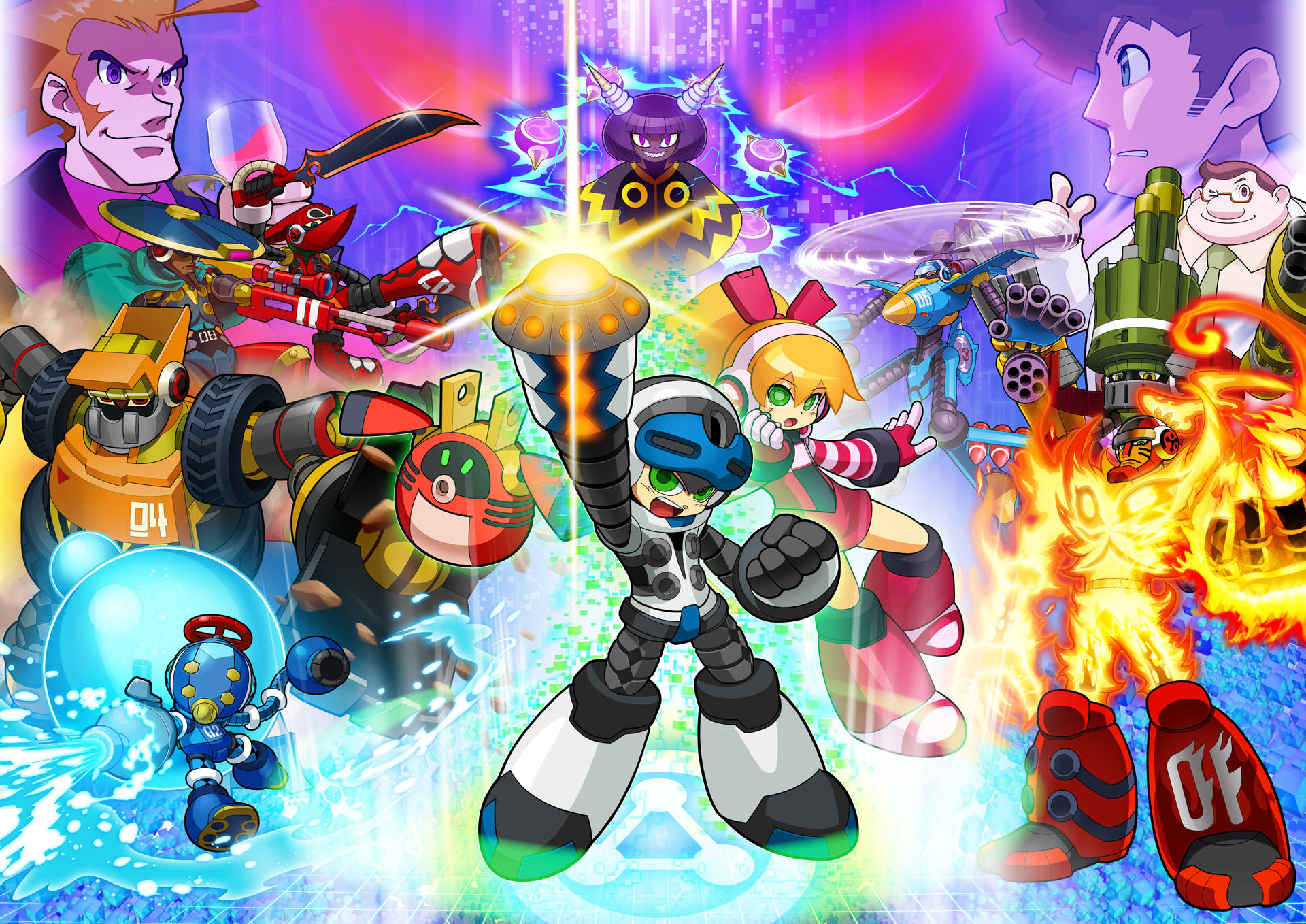
Mighty No.9 has finally been released, after years of anticipation and promises. With its release has come a host of mixed emotions and broken controllers. Mighty No.9 is presented as a spiritual successor to the mega man franchise and was conceptualized by game industry Veteran Keiji Inafune. The man behind classic titles like Mega Man X and Dead Rising.
The games artwork was done by another industry Vet, Shinsuke Komaki, who was a key illustrator for the Mega Man Battle Network franchise. As you can see this game had an All-Star team behind it. Unfortunately, as far as critics and most backers are concerned, the game was unable to live up to the monumental expectations it had raised.
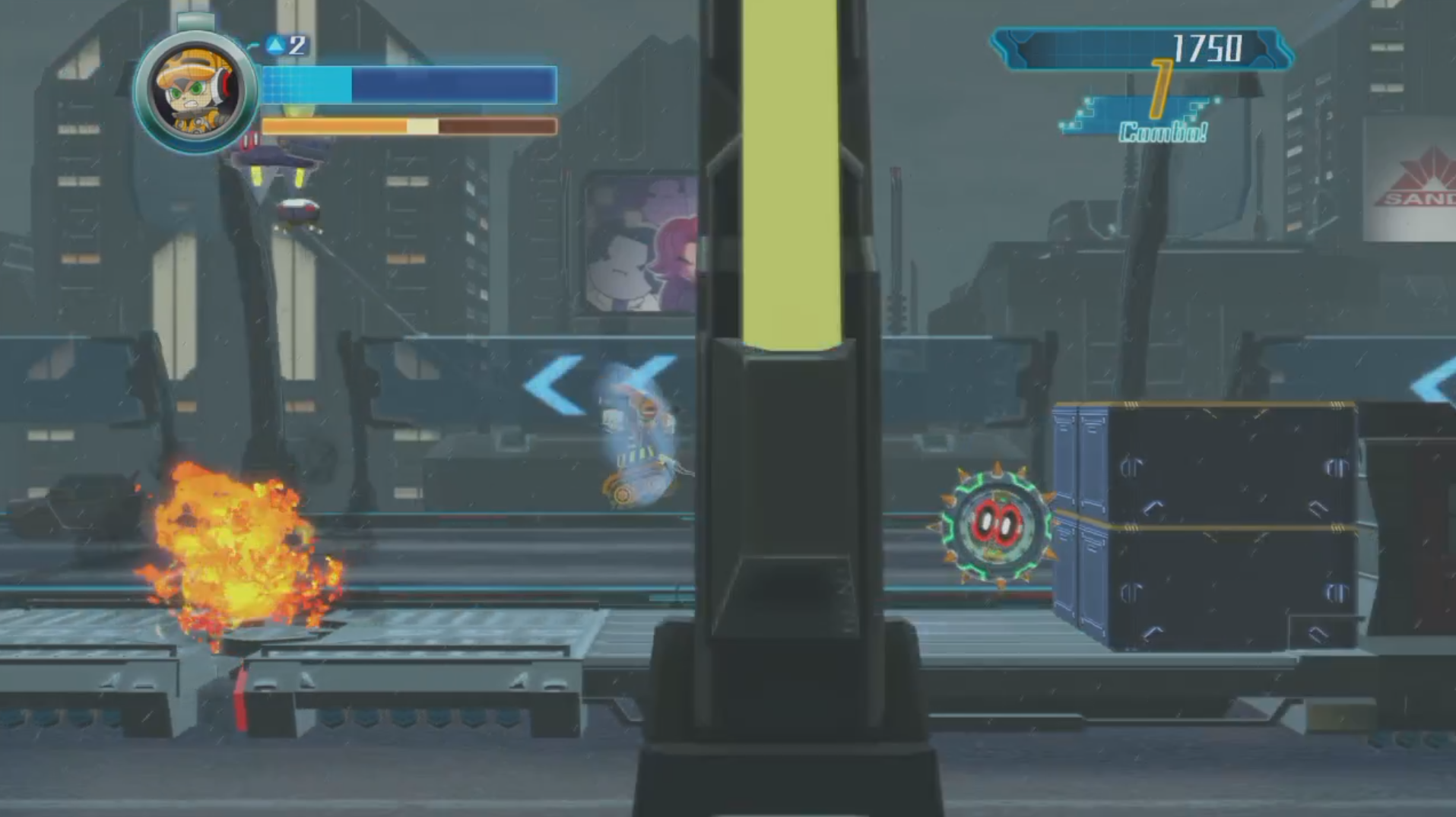
The game starts with Beck (Mighty No. 9) appearing on a city street and already I am reminded of Mega Man 8 and X. The story is presented to you immediately, while introducing core characters and game mechanics. Beck controls about as well as you would expect a game like this to handle. While I can appreciate the call back to retro gameplay it can be a bit too touchy at times.
For instance, when making your way through Mighty No. 6’s level, you’ll find yourself higher up the tower when the wind begins to blow you around whenever you jump. When it starts, it’s not too much of a problem however, this soon becomes a massive design flaw. As you are not given enough room to maneuver and combat enemies while keeping a stable footing. Some people may say that this is nothing more than an issue of the players skill but I can assure you that is not the case.
I don’t claim to be a great player of games, in fact, I proudly wear the title of worlds okayest gamer but the rate of movement applied to your character when the wind catches you is completely disproportionate to the amount of space you have to work with.
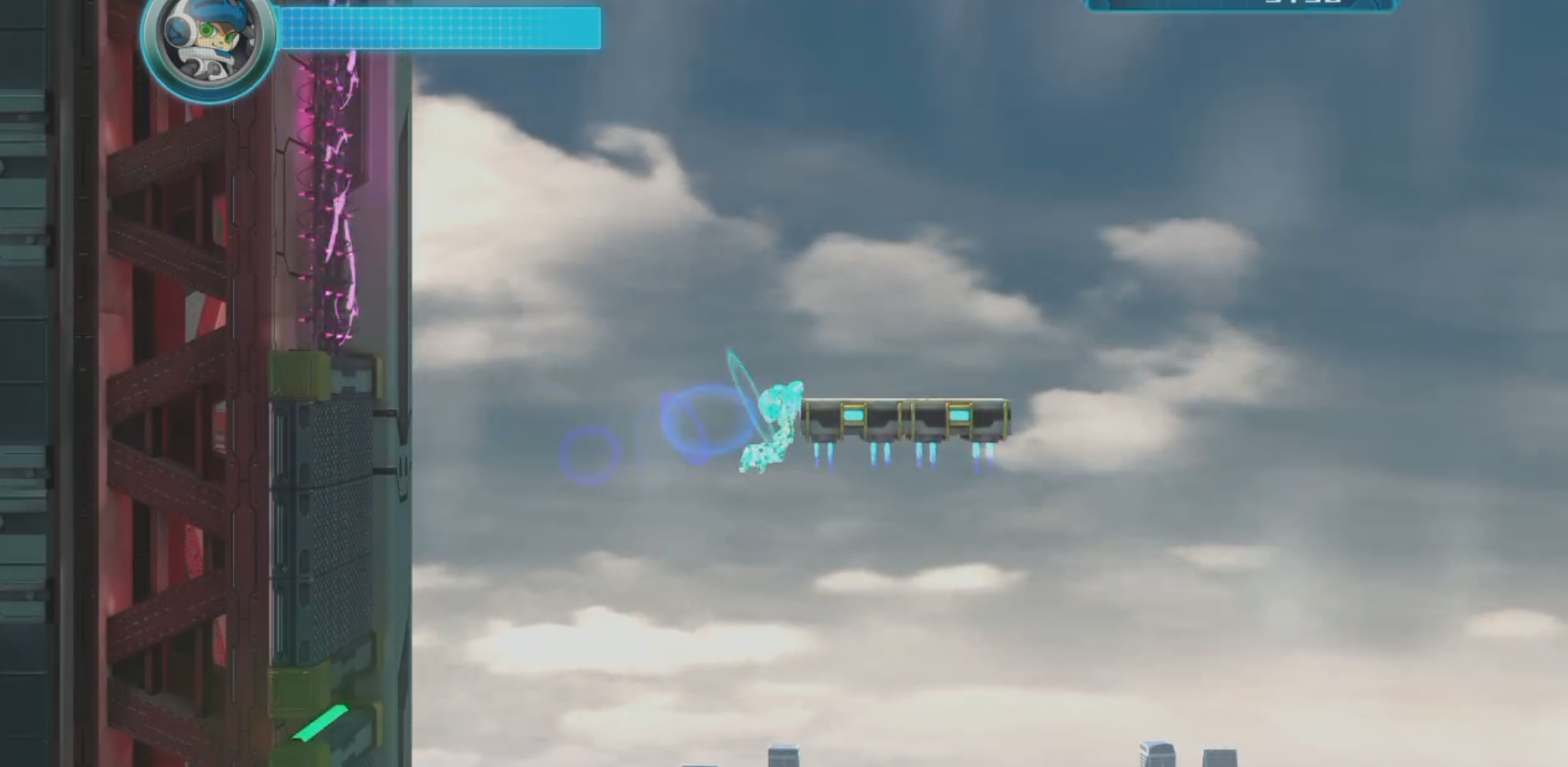
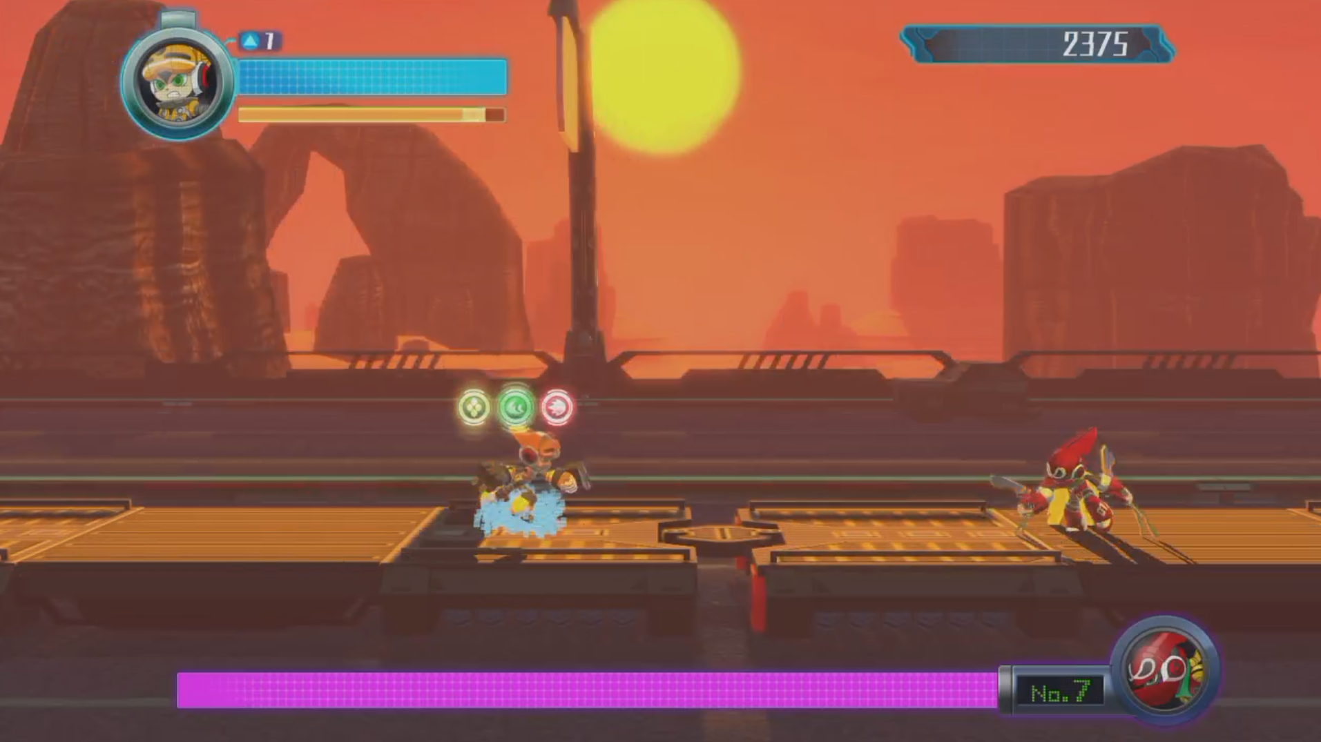
Mighty No. 9 has a dash mechanic that also serves as a way of absorbing enemies energy when they begin to glow. This energy is converted into power-ups and healing items for Beck. It’s difficult to tell which colors correspond to which power up but as far as I can tell it works something like this.
- Yellow = Shield that reduces damage slightly
- Red = Fire shot that travels through enemies and does extra damage
- Blue = Health capsule energy. Once full you can use a health pack when needed
- Green = increases becks movement speed. This is not a good thing most of the time.
The enemy design and placement leaves a lot to be desired. It feels as though enemies have been randomly placed without any thought as to how they were meant to interact with the environment or challenge the player. Sporadic design does not equate to difficulty incline, it simply presents the illusion of a game being difficult.
If I didn’t already know the history of this game and what it took to bring it to life, I would be inclined to say that Mighty No. 9 feels rushed. I know that sounds bizarre, even saying it out loud I feel a bit compelled to smack myself. Unfortunately it’s the truth, the game is a mess and it amazes me that its creator is willing to own up to that.
The concepts and design choices the game has taken from Mega Man have not translated well and with time they may be able to patch a great deal of them or even give the game a complete overhaul. Now let’s take a minute to talk about what the game does right.
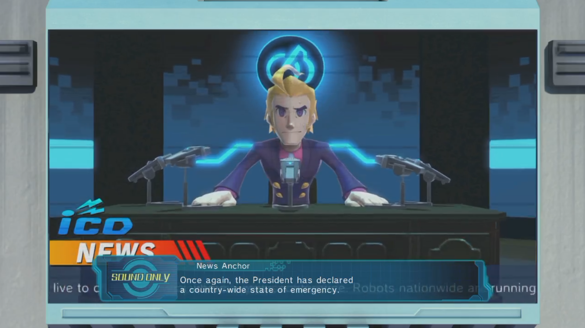
Many people have been complaining about the games graphics and lack of animation during cut scenes. I think for one applaud the use of still animation during cut scenes because it makes me feel as though I’m playing an older game. Somewhere along the lines of a Nintendo 64 game and I love that, it perfectly encapsulates that feeling of nostalgia, just like I’m ten years old again.
If nostalgia had been the sole purpose of this game then it would have been a massive success. Unfortunately that’s not the case here and if you purchase Mighty No.9 expecting it to fill some kind of mega man shaped void in your heart, you’re going to be extremely disappointed. The games art style is adorable and seems polished on the surface but overall contains too many graphical hiccups to redeem itself.
Now all that being said allow me to take a moment to say the following.
Despite this games many flaws and poor execution I do enjoy it, I enjoyed it a great deal. It feels like a step in the right direction for this style of game and even if they hadn’t quite hit their mark with the first one, they’ll definitely receive enough feedback from this to make sure that the next game is everything that the public wanted this game to be. Let’s just hope they don’t need another 4 million in kick starter money to do it.
