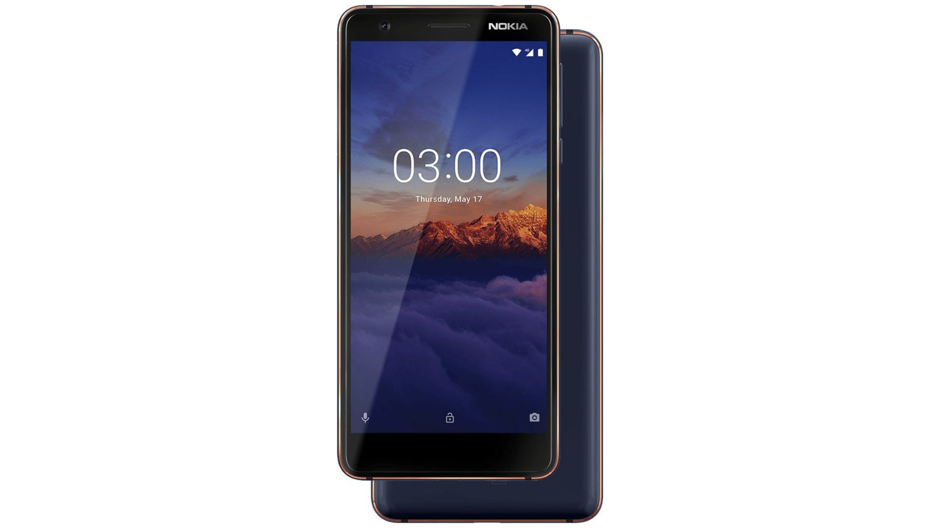
This tech fool loves reviewing budget phones. There’s fun to be had in seeing what the designers and engineers can do with a limited cost per unit. Nokia have pedigree in delivering incredible mobile experiences for less and their recent Android-led revival has recaptured some of that bang/buck magic. Nokia 3.1 comes in at the lowest end of the Android scale but you wouldn’t know it sometimes. Android One’s breezy, bloat-free UI is breath of fresh air. The device looks amazing and it’s matched by a solid feel.
How Much?
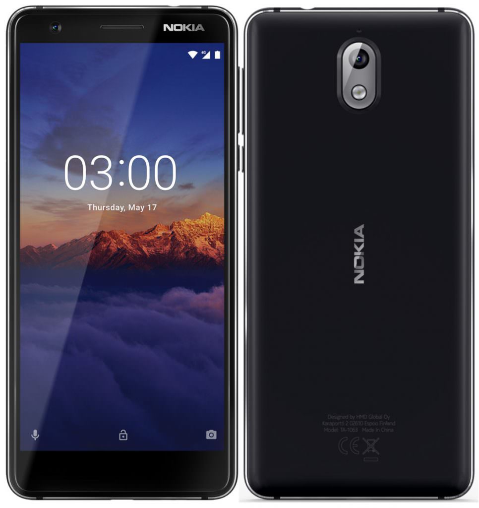
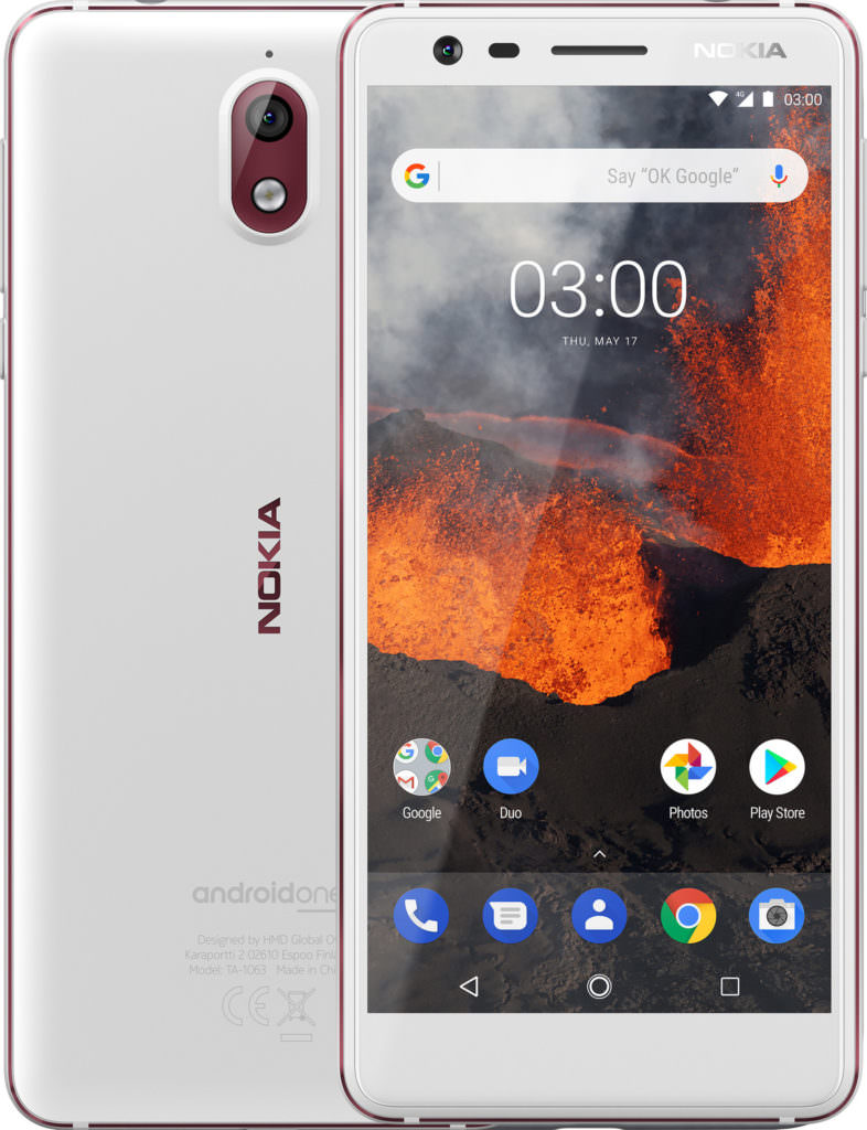
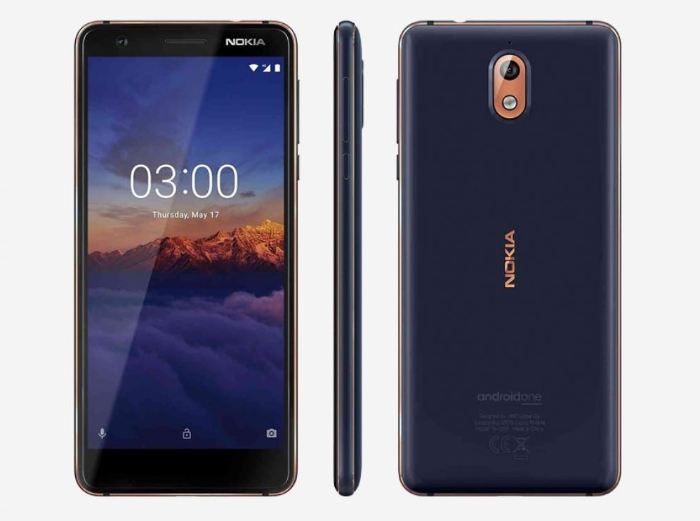
Nokia 3.1 looks as good as a mid-ranger or sub-premium. The gently curved front panel, the bevelled aluminium frame and minimalist but attentive design are not common at its €159 price. While the device might have a little extra bezel over more expensive handsets, it’s not actually that noticeable – the curves and aspect ratios participate in a trompe d’oeil that cover for a ~70% screen-to-body ratio.
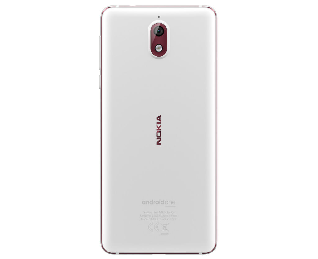
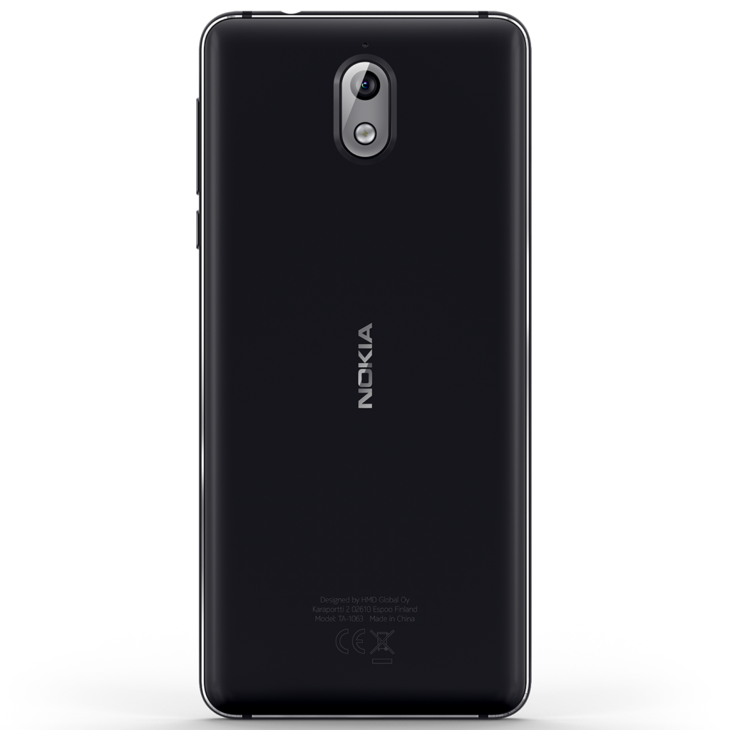
The rear cover is plastic and that’s not a surprise for less than 200 beans. The rear casing looks like brushed aluminium or the ceramic used on Nokia 7 plus and adds to the device’s good looks rather than take away.
Switching apps comes with a little delay that doesn’t destroy the performance but is noteworthy nonetheless
The handfeel is solid to match – the aformentioned machined aluminium frame and matching all-glass facade dominate the weight of Nokia 3.1. At 8.7mm thick, it’s slim but not flimsy and the textured rear wants to stay in your hand.
Nokia are on a roll when it comes to design quality. While Nokia 3.1 isn’t as distinctive as 6.1 or 7 plus, nor does it tap into the ‘copper’ vein that defines upmarket Nokiae (plural), it looks and feels price-defying like its more expensive siblings.
for Nokia 3.1’s budget asking price the display is perfectly acceptable, even a little commendable
Decent Screen
Nokia 3.1’s display is above-average in its range. The 18:9 720×1440 panel certainly does the job in the device’s 5.2″ form factor. The tall screen is nice in a budget phone while the smaller size covers for the lower pixel count.
Colours aim for natural but can be a little off in either direction depending; a little oversaturated on some occasions, a little muted on others. The screen is bright but has its limits – managing legible but no better outdoors on brighter days. But overall, for Nokia 3.1’s budget asking price the display is perfectly acceptable, even a little commendable.
Endurance can be good if users stay in the device’s lane of a few hours social media, messaging, 2D games etc. per day
Adequate Performance
Our review model comes with a tight 2GB of RAM and this is a bottleneck that keeps the performance from being more than usable. Switching apps comes with a little delay that doesn’t destroy the performance but is noteworthy nonetheless. This underlying handicap is largely the result of the meagre RAM but not helped by a budget processor.
For every day tasks and some light entertainment, the Mediatek MT6750 is capable. Endurance can be good if users stay in the device’s lane of a few hours social media, messaging, 2D games etc. per day. Extended periods of screentime and streaming will munch through the battery.
Ask too much of the device and it will protest. Some throttling, a little warmth and a lot of expended battery are Nokia 3.1’s way of telling a user to keep it simple. Users wanting to game or use power hungry programs will need to close apps and keep an eye on the juice lest they burn through the 2,990mAh battery.
16GB of on-board storage means a user will need to invest in a micro-SD card if they are snap-happy or a music-owner.
It must be noted that a 3GB RAM, 32GB storage model is available but not in Ireland, the UK and US.
Pre-loaded guff like Booking.com, Air Fighters and Ebay annoy me more than they should – but none of that bloatware nonsense is here.
Are You Afraid of the Dark? (What a Show…)
Nokia 3.1 takes surprisingly nice shot under an unfortunately limited set of conditions. On sunny days or with warm indoor lighting, stills from the 13MP single-lens main cam have clarity, colour and character. Portraits from the selfie cam can yield flattering results in the same conditions. HDR support also depends on the quality and quantity of light to get some noticeable dynamic range.
The frequently cloudy skies of the North Atlantic give sharp but cold images. The flash can help restore warmth for closer subjects but it can be hard to find the right lighting to please Nokia 3.1’s sensors. Indoor lighting is tricky; certain illumination technologies just don’t work well, again delivering sharp but cold captures.
Low-light performance is uniformly poor across stills, videos and all types of each. There is an innate and scaling noise that emerges when the photons are a little scarce. A noise that ruins a significant fraction of snaps and gives pause when taking Nokia 3.1 out for some night ‘grammage.
The limited snap potential isn’t held back by a lack of versatility though – a manual mode is available. This is a welcome addition to the versatility of the stills camera. Manual mode is even more noteworthy as some premium devices lack such a feature.
Paring back on tabs, keeping on top of background apps and avoiding heavy extended workloads might be too many concessions to style for some
The Should Only Be One
Android skins at the lower end of the price scale are usually known for their bloatware. Games and apps that users are fed to subsidise their budget smartphone while eating the scarce resources the devices have. Stuff like Booking.com, Air Fighters, eBay etc. annoy me a little more than they should – having to delete them when I review most sub-€350 handsets becomes a chore.
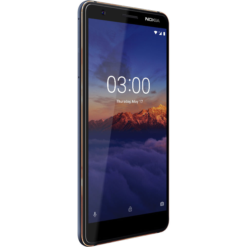
Nokia 3.1’s Android One furnishings and minimalist approach to software is refreshing and more than that, pleasant and functional. Android 8.0 is not the bleeding edge of the platform neither is it as dusty as other budget Android offerings. Features like Slices will be welcome if we ever get tossed some Android Pie crusts from the top-table but nothing else is missed too much.
Specifications:
- Chipset: Mediatek MT6750; Octa-core (4×1.5 GHz Cortex-A53 & 4×1.0 GHz Cortex-A53), Mali-T860MP2
- Memory: 16GB Storage, 2GB RAM (32GB, 3GB model available in other regions)
- Display: 5.2″ IPS LCD, 720 x 1440 pixels, 18:9 ratio, scratch/grease resistant coating
- Rear Camera: 13 MP f/2.0, AF, LED flash, HDR (stills only)
- Front Camera: 8 MP f/2.0
- Video Capture: 1080@30 (Main), 720@30 (Selfie)
- OS: Android One programme – currently Android 8.0
- Connectivity: LTE (150Mbps download), micro-USB 2.0, 802.11 a/b/g/n dual-band, A-GPS, GLONASS, NFC, Bluetooth 4.2, MicroSD card slot (up to 128GB)
- Battery: 2,990 mAh
- Dimensions: 146.3 x 68.7 x 8.7 mm
- Colours Available: Black/Silver, White/Iron, Blue/Copper
Mainly a Pretty Face
While there is nothing wrong with giving budget users a premium look and feel über alles, a little more under hood might be preferred. Nokia 3.1 can need more attention than other budget phones to really get the best from it. Paring back on tabs, keeping on top of background apps and avoiding heavy extended workloads might be too many concessions to style for some.
The camera’s two-faced nature isn’t alone in its range so the lacking low-light performance and specific HDR sweet-spot can’t be slated too hard. Features like Panorama, Beauty mode and the aforementioned and admittedly flighty HDR are welcome and useful when the time comes.
The build quality is one area where the pennies were well spent – long may the tradition of sturdy, cheap Nokiae last.
Review handset provided by manufacturer
